
Sylva
Context
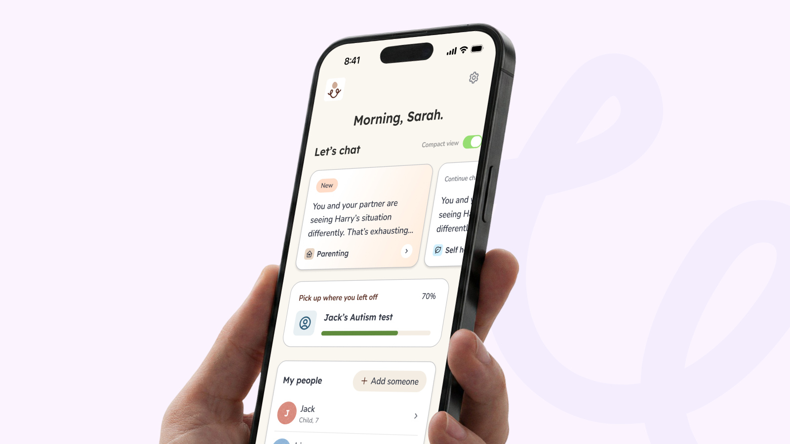
Sylva is a mobile app that helps parents of children with additional needs understand their child and find the right support. It is also a Class 1 medical device.
I lead design end to end, from discovery and user interviews to the shipped product and the design system behind it.
The Problem
Parents arrived stressed and unsure where to start. Tests went unfinished because people didn’t see why they mattered, and chat had to stay supportive while putting safeguarding first.
What I Did
- 01
Research
Introduced, found and ran weekly user interviews with parents, and helped on the Bangor University study.
- 02
Design System
Built Sylva’s Figma component library and a new way of working between design and code in Figma.
- 03
Weekly Sprints
Ran discovery and shipped in weekly sprints, releasing at least once a week.
- 04
Full Redesign
Redesigned onboarding and every app page, with a new paywall built on RevenueCat.
- 05
AI In Delivery
Connected the component library to Claude to write tickets and check what was built against the designs.
Results
Onboarding
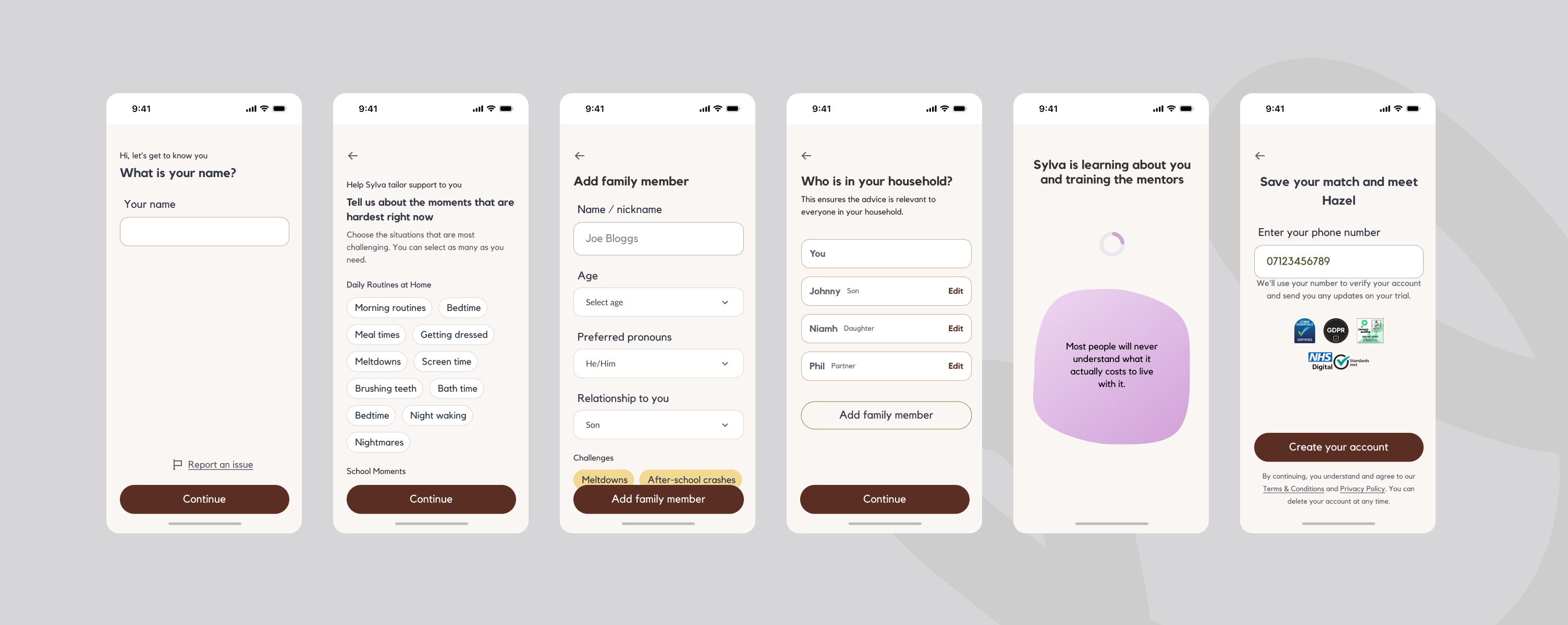
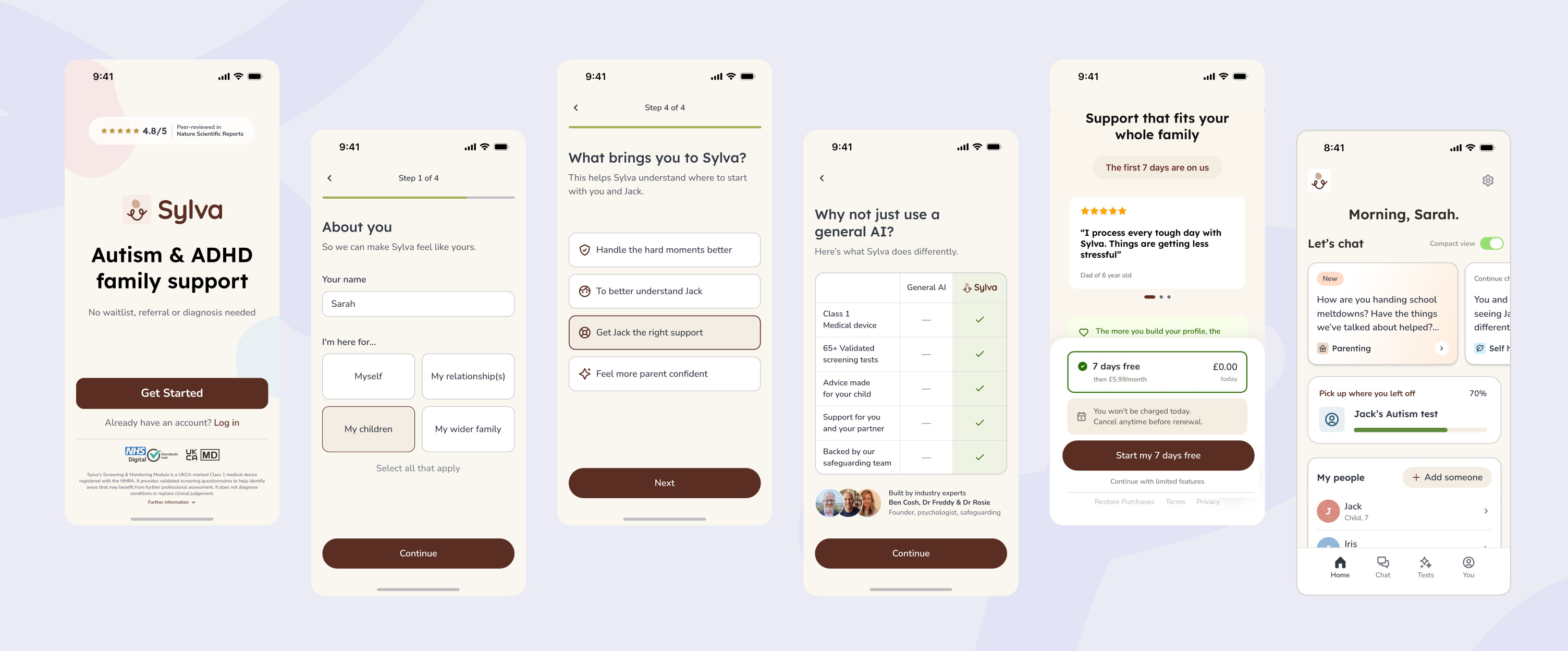
By adding more depth and personalisation to onboarding, moving account creation to the middle and putting a paywall at the end, trial-to-subscribe conversion reached the top 10% of its category (RevenueCat benchmark).
Tests
Tests are the foundation of Sylva, because their results shape the rest of the app. But too few people were taking them, because they didn’t know why they mattered. The redesign makes the reason clear first, makes each test easier to understand, and gives people everything they need before they start.
The test journey as a decision flow: a reframed check-in, paths for where each parent is at, and results that make the value and the next step clear, with a prominent note that results are not a diagnosis.
Test User Flow In Figma
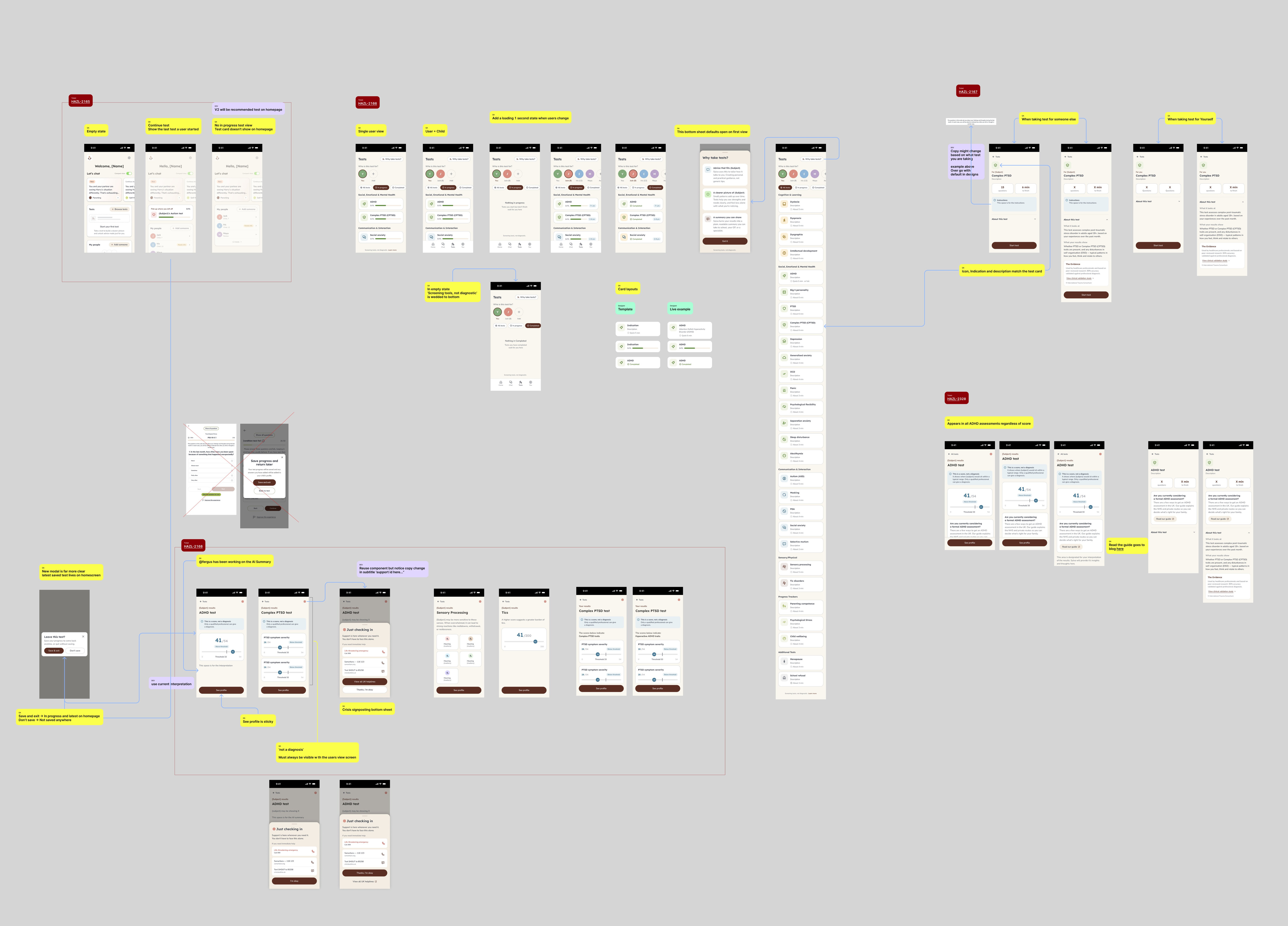
The full test flow, from a first-time user taking their first test to an experienced user returning to it.
The Finished Tests
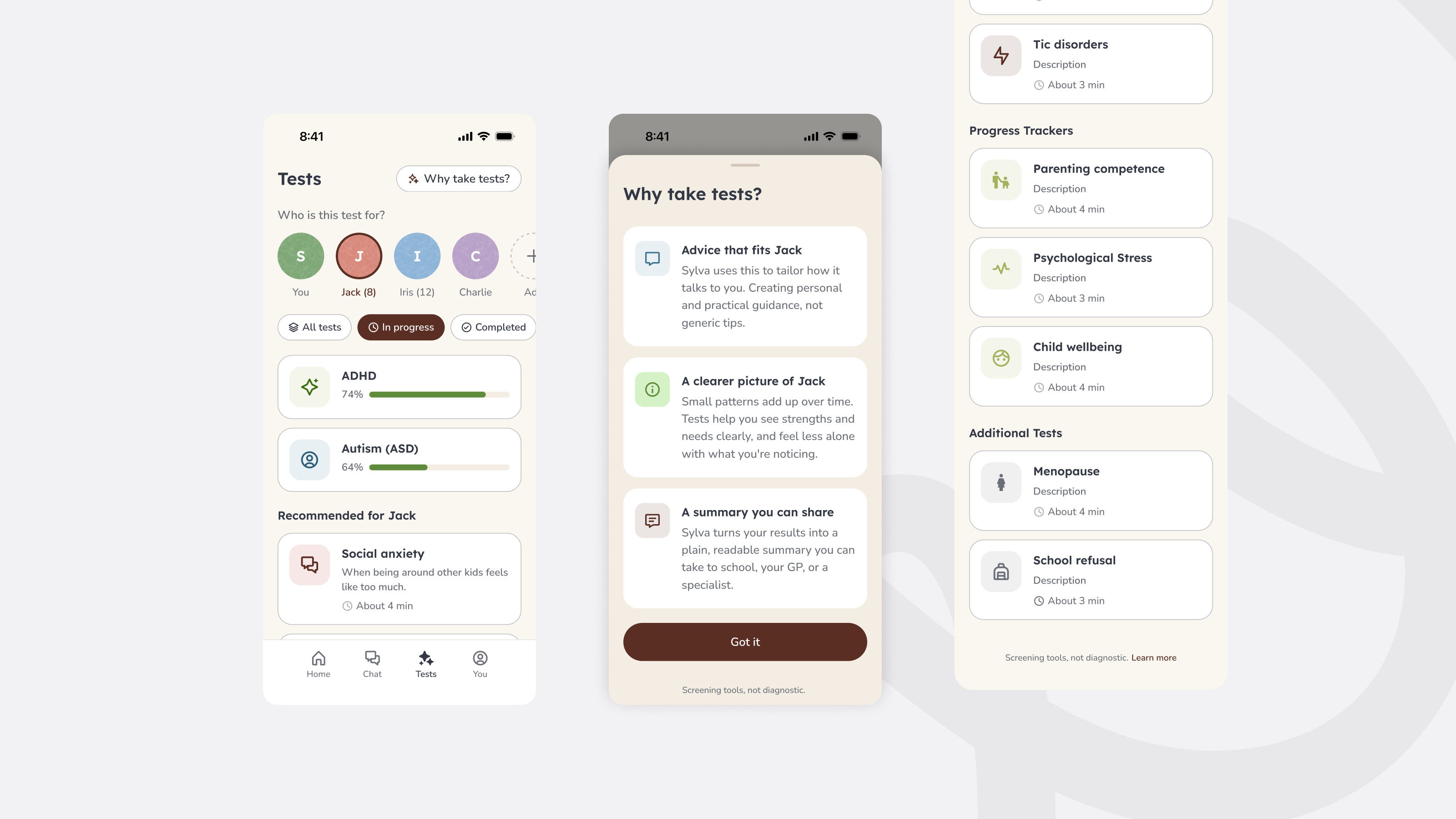
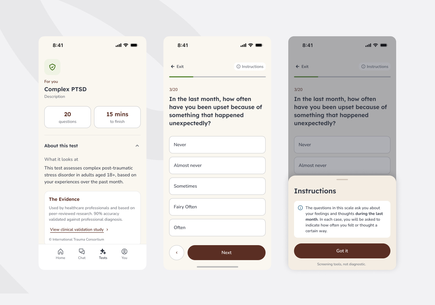
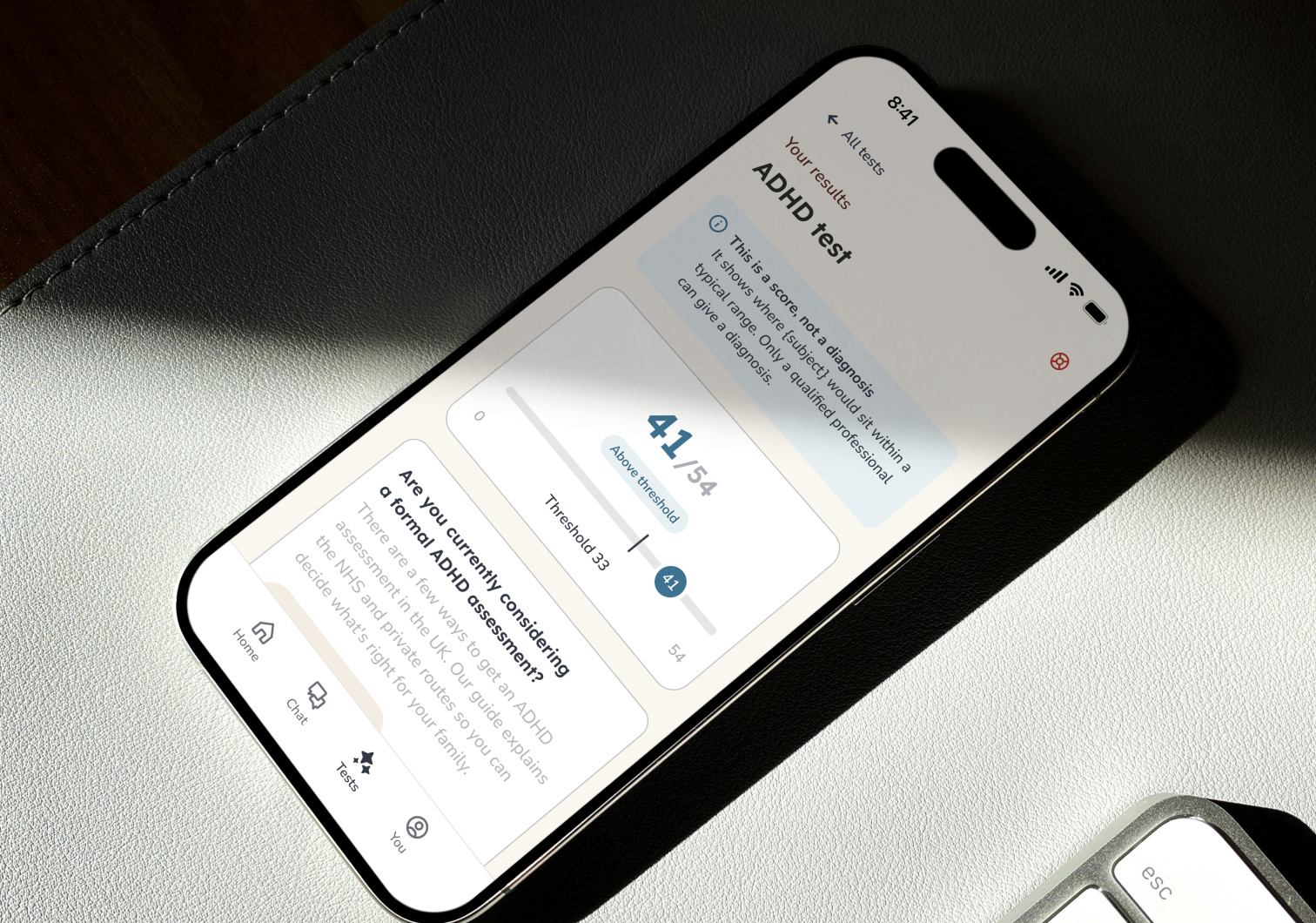
The redesigned tests: a “Why take tests?” explainer up front, a simpler flow with clear instructions, and results framed as guidance, not a diagnosis.
Chat
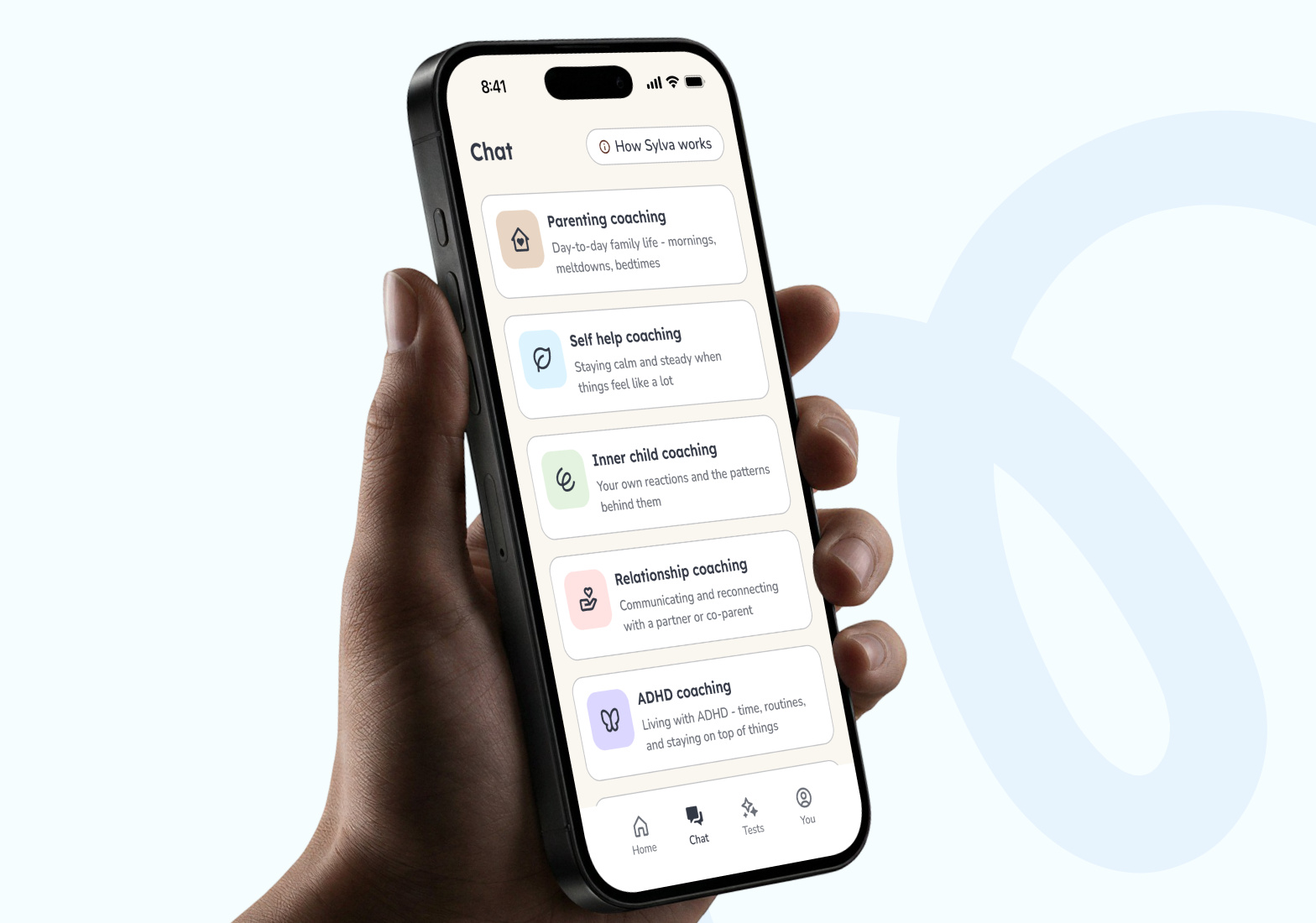
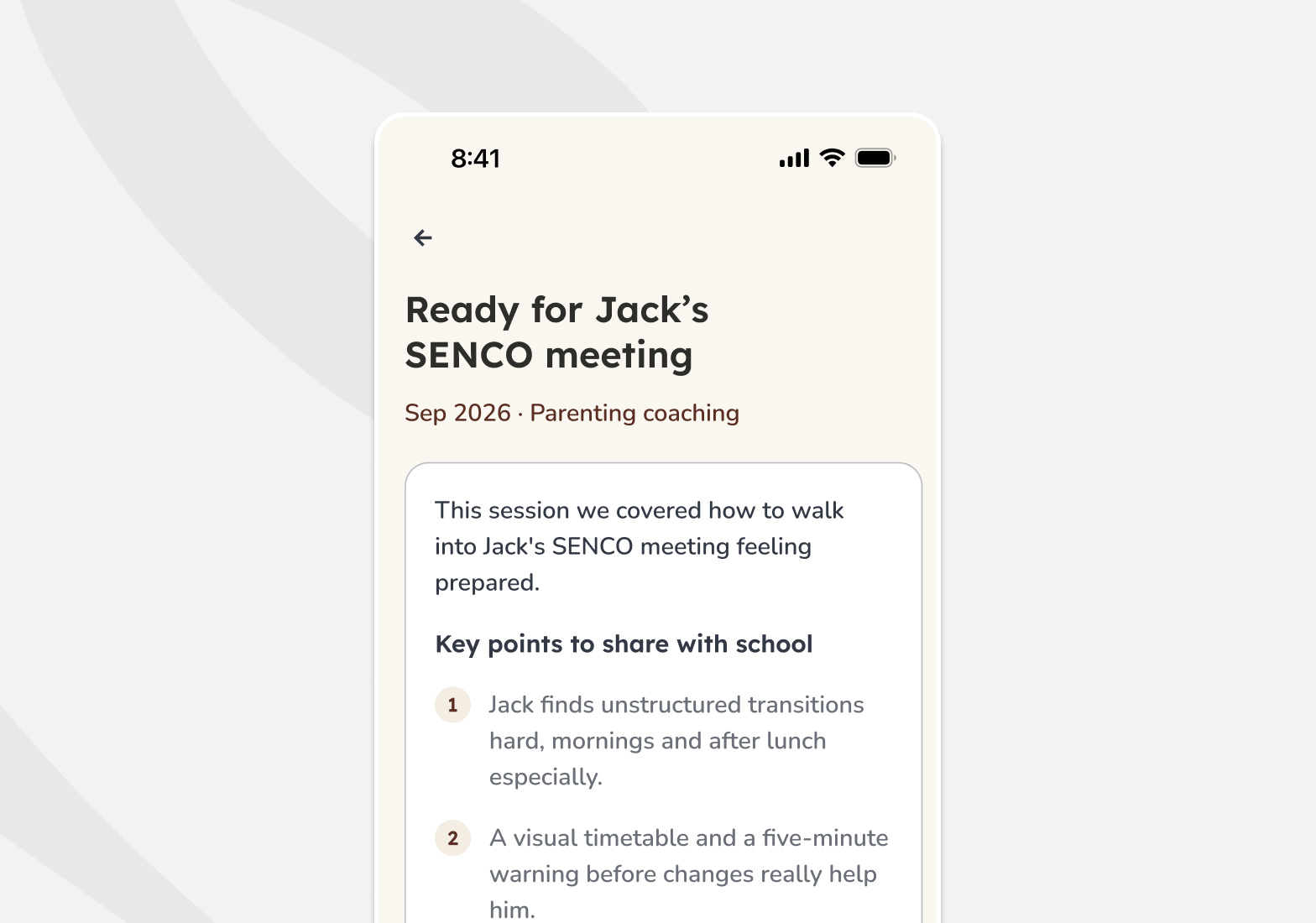
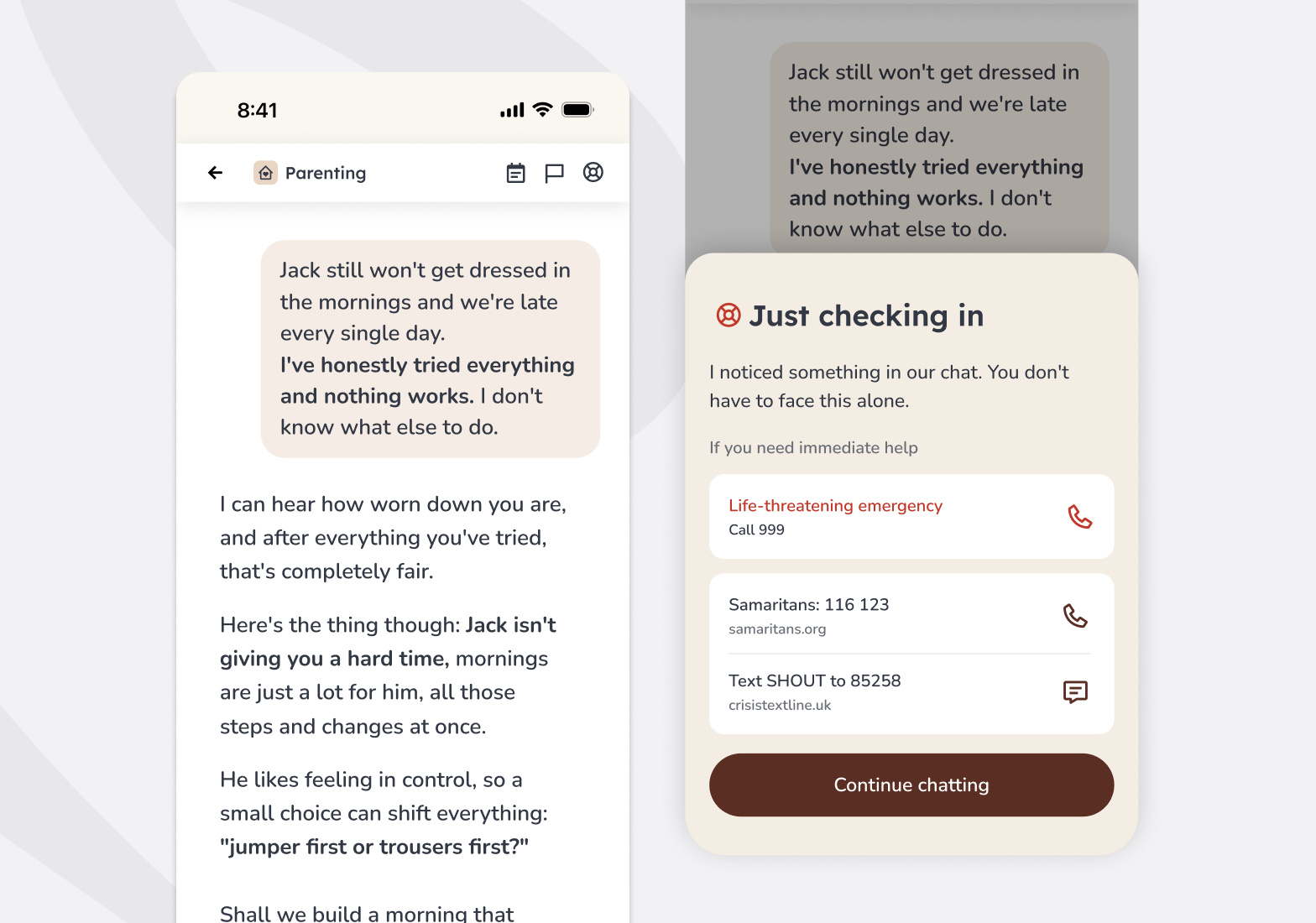
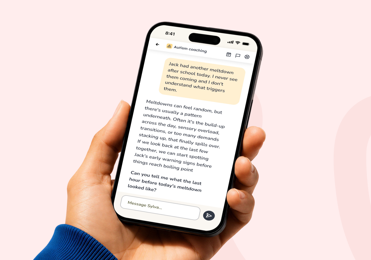
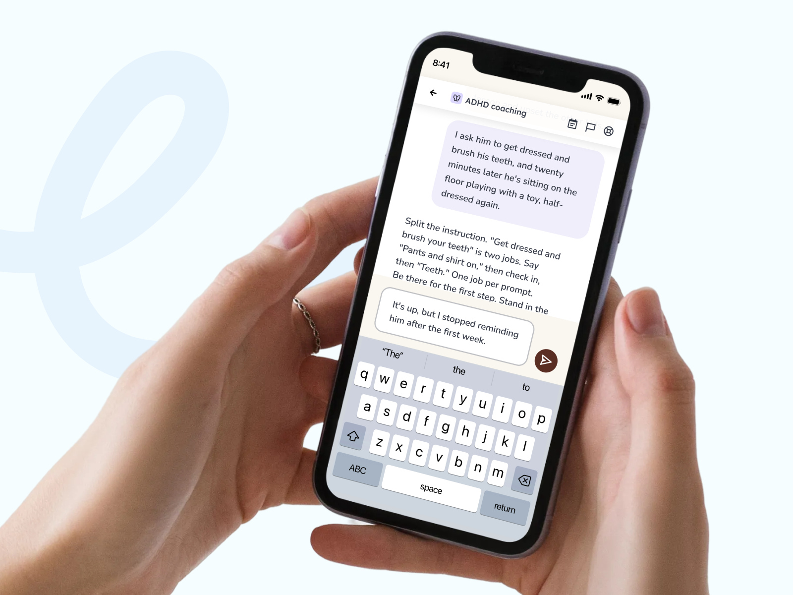
The chat page needed to be simple and effective for stressed parents, with safeguarding as the first priority. Each Sylva specialism has its own soft personality and colour.
“I feel heard and I feel seen, and it’s so validating.”
Across The Product
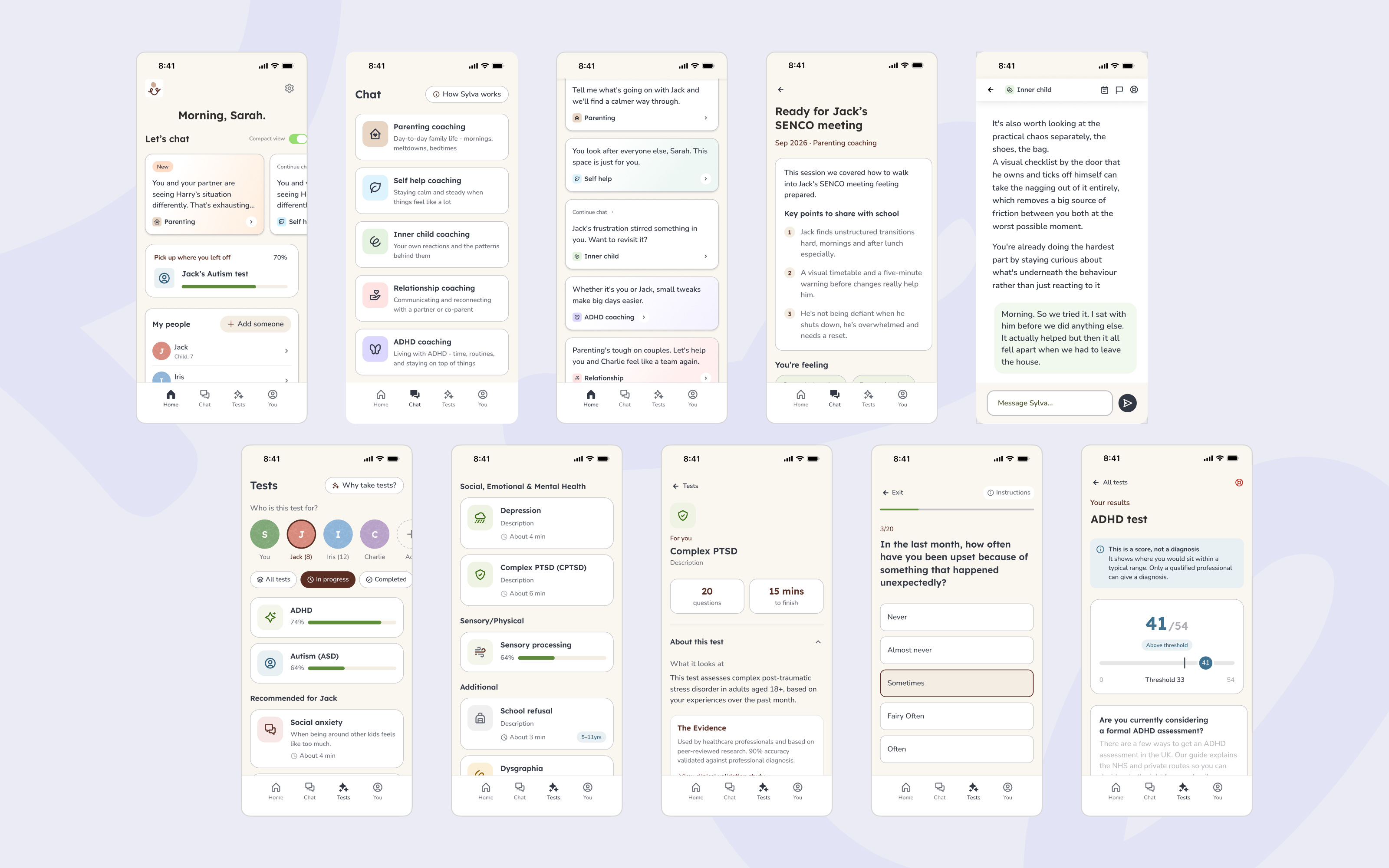
A selection of pages from the wider redesign.
How I Use AI
AI sits inside how the team designs and ships at Sylva, and I review everything it produces.
- 01
Design To Code
Claude, connected to Figma, checks the built screens against Tailwind and the design system.
- 02
Tickets
Claude writes tickets and bug tickets straight from the designs.
- 03
Compliance
Our compliance document is linked to Claude, so tickets are tested against the standards before they are built.
- 04
Meetings
Meeting agents keep decisions and actions on track.
Where AI Got It Wrong
Left alone, AI writes long, waffly tickets that tick every box. Now I write the core first, then AI checks it against compliance and our template.
Time Saved
Using agents and strict ticket templates, I’ve 5x’d my design output, which lets me focus more on our users.
The Component Library
Sylva Design SystemFoundations, components and states, in Figma. Open in FigmaKind Words
“He’s extremely creative, honest, and brings the best out of people.”